The Brief
Elais Service Apartment is one of service apartment projects managed by PT Dyokara Nusantara. This project was undertaken to answer the housing needs of migrant community groups living in the city of Medan, Indonesia for a certain period of time.
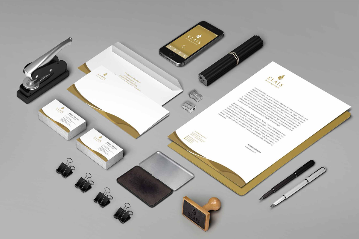
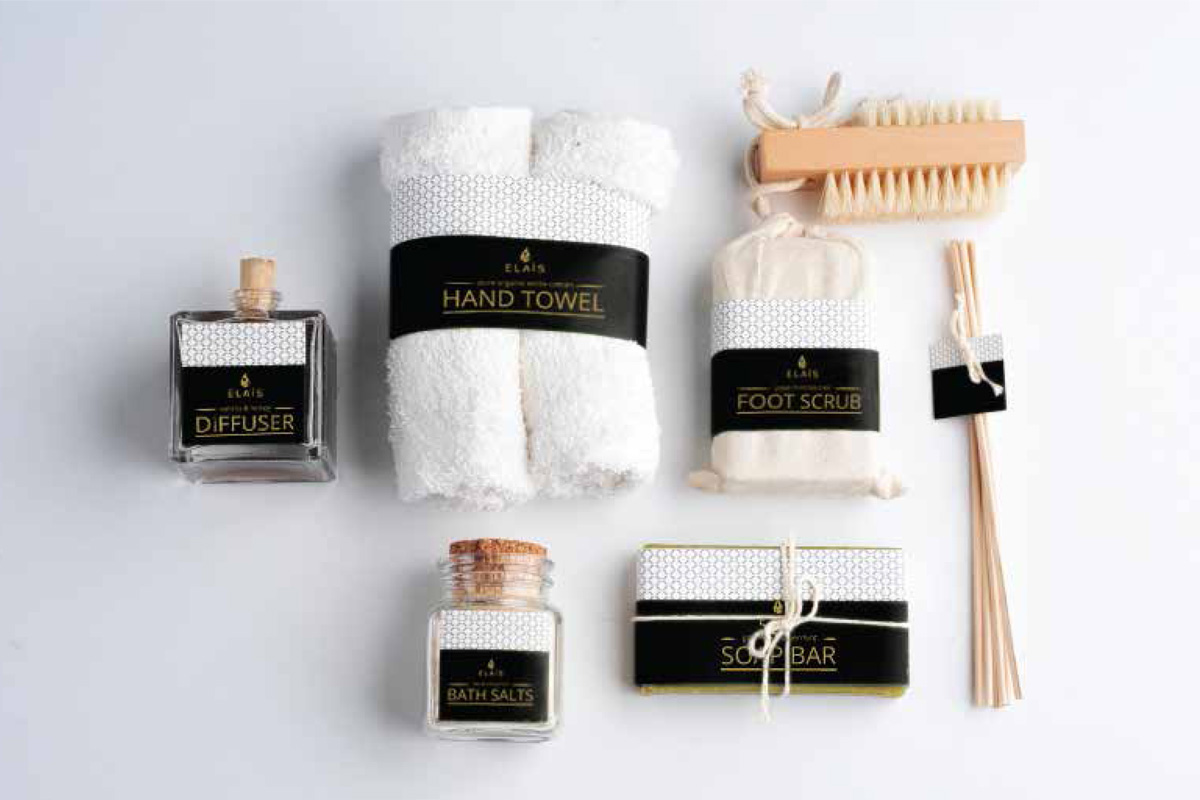
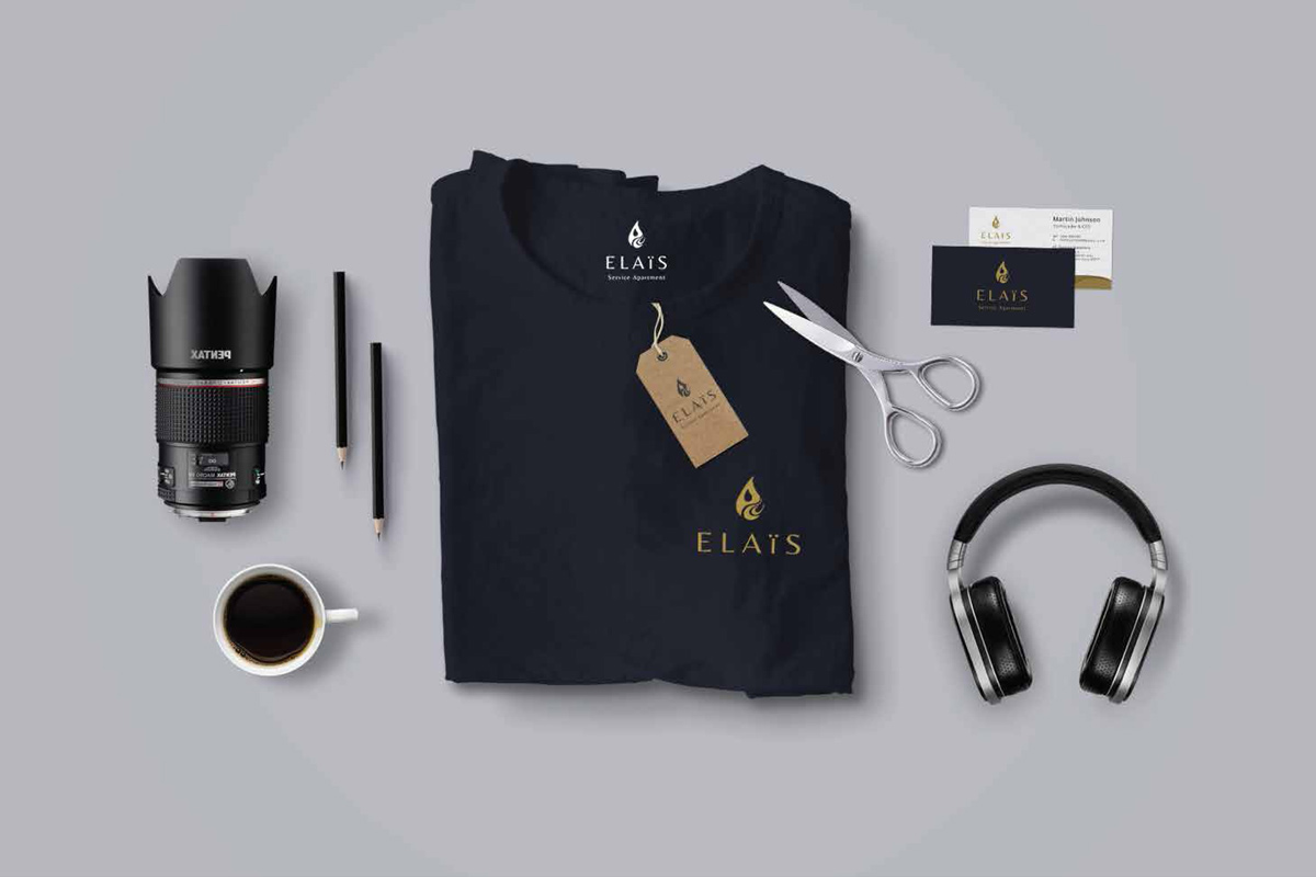
They need a comprehensive and integrated identity system so that the values of the elais themselves are well conveyed.
The Concept of The Logo
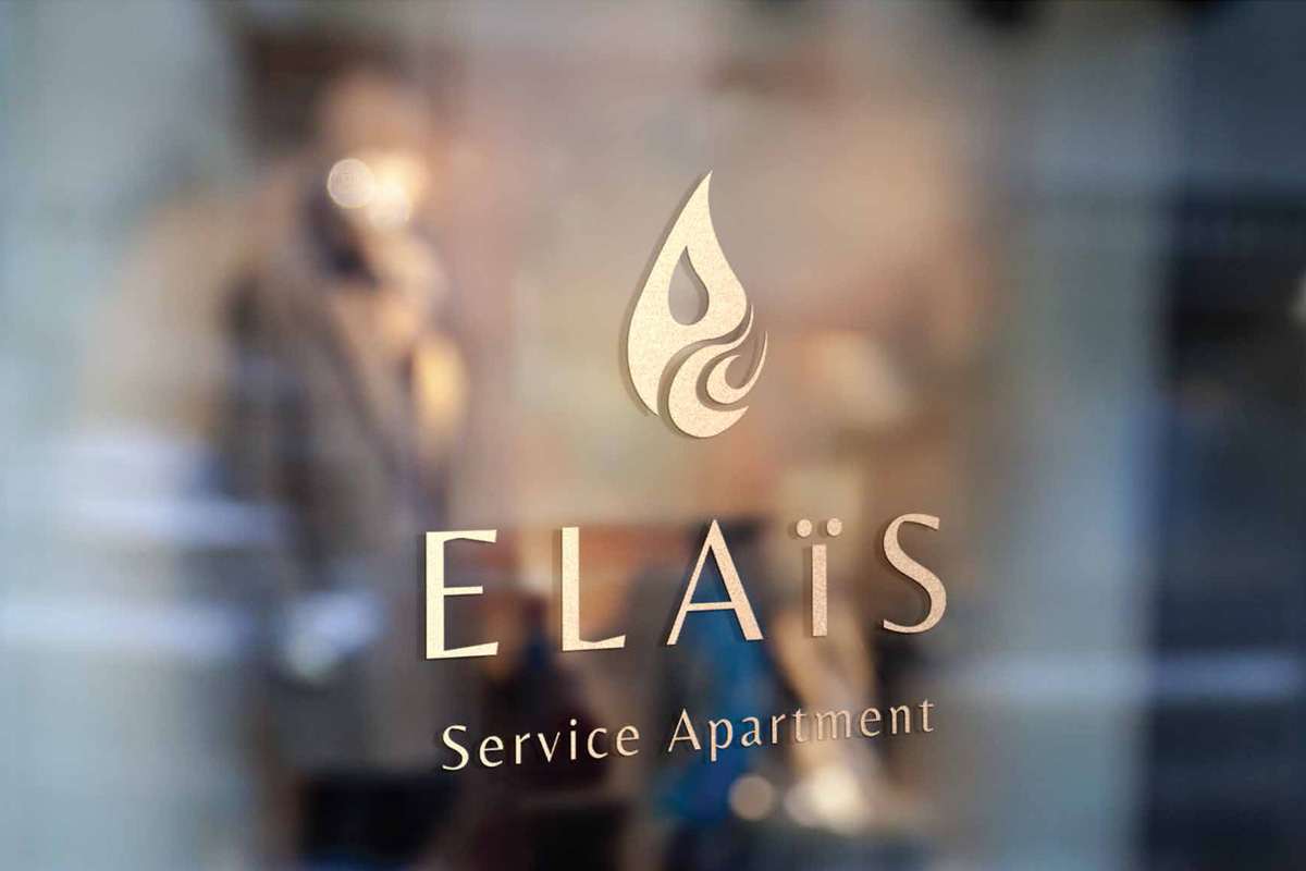
Creative concept image logo refers to the oil droplets combined with the letter E.
The combination of oil droplets with the letter E depicted in the form of logogram artistic, dynamic, elegant describe this apartment is always promoting the values of hospitality (flexibility), harmony with nature and buildings as well as providing shelter for customer convenience.
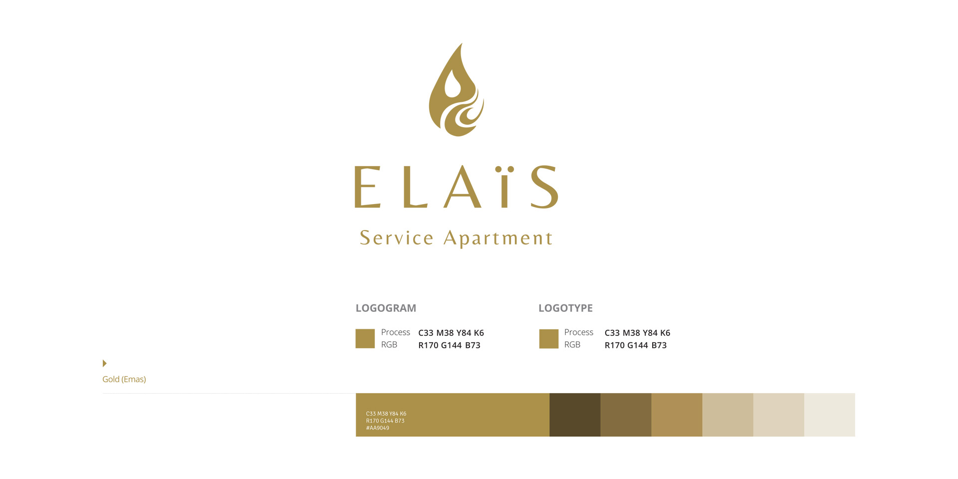
The selected color gold color which indicates the color of prestige.
To select a letter in san serif font / without fins create an impression of modern, contemporary and efficient
Philosophy of Color
 Gold color gives the impression of prosperity, active, and dynamic.
Philosophy of Shape
Flexible, round arch, with no square corners or straight lines explains the magnitude of the sense of balance and harmony between man and nature and among the citizens of Earth.
Typeface
As important as the color, the font application in the Elais – Service Apartment Logo should be considered as a vital part of the entire composition, and therefore must be used as directed in this guideline without any exception, in order to maintain the image consistency and continuity of the logo itself.
The font or typeface to be used on any official document and application material of the logo is : Open Sans. Open Sans is our primary & secondary typeface. It has the character of an upright stress, open forms and a neutral, yet friendly appearance. It represents the spirit of Elaïs – Service Apartment.

